Let’s begin with a fairly rich and complex page from the
domain of the U.S. National Aeronautics and Space administration (NASA) in a
website at the Goddard Space Flight Center (GSFC):
GSFC Earth Sciences (GES) Distributed Active Archive Center
http://daac.gsfc.nasa.gov/DAAC_DOCS/gdaac_home.html
This page is a gateway to data collected by NASA sattelites
which record the spectrum of radiation reflected from the earth. This data can
be interpreted as giving measures of the temperature, density of atmospheric
ozone, degree of vegetation cover, etc. all over the earth, as seen from space.
The primary content of the page is a menu of seven links to such datasets with
brief textual descriptions and associated color images showing one important
application of each type of data. This is a dynamic webpage: when the mouse is
moved over the links (but not clicked), a new color image and caption text
appear for each link.
The first link anchor is:
Atmospheric
Chemistry
Ozone and other trace gas compositions, dynamics and energy interactions of the
upper atmosphere.
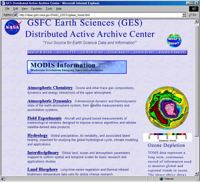
The accompanying image is a polar-view globe map with a few
dotted longitude and latitude lines and is colored to represent data values.
Below is a spectrum key, with color spectrum labeled in hundreds of Dobson
units. The caption text has a header, Ozone Depletion, and reads:
“TOMS data represents a long term, continuous
record of information used to monitor global and regional trends in ozone. The
image above shows the October 1996 Antarctic ozone hole as viewed by the TOMS
ADEOS instrument.”
The second link anchor in the menu is:
Atmospheric
Dynamics
3-dimensional dynamic and thermodynamic state of the earth-atmosphere system,
from satellite measurements and assimilation systems.
The image in this case shows flow patterns of atmospheric and oceanic ‘currents’
against a land-ocean topography. Flow lines are represented by arrows forming a
vector field.
Let’s consider the page as a whole and the dynamic images and captions for these two links. I will present a brief analysis of the textual-linguistic and visual-semiotic features of the text and their integrative interrelationships in terms of the three generalized semiotic functions common to both: presentational, orientational, and organizational.
(Please note that the page is occasionally updated; for
example recent versions have added a warning note about improper use or access,
i.e. hacking.)
It is often useful to begin a multimodal analysis with the
visual-organizational composition of the whole page, because, as Arnheim noted,
this is the salient structure which guides the eye in its traversals across the
page.
There is a top frame with NASA logo at left, title in large
serif type, below the title a motto in small quoted italics, at right an
iconlink for What’s New (a colored globe with superimposed text, similar in
size to the NASA logo icon at left). Below these is a single thin blue
navigation bar (probably an image map), dividing the top matter from the page
content. Below the bar is a graphical link for highlighted information on a new
sattelite instrument (MODIS). It is a rectangle with a bluesky-and-clouds
background overprinted with large and smaller type.
The main content of the page, all of which has a uniform
sky-blue background, consists of the menu of textual-phrase link anchors noted
above, each of which is both a link and an active mouse-over site, and each of
which is followed by a descriptive gloss.
Most interesting are the results of the on-mouse-over
script, which place in a frame at right a complex graphical image and below it,
as a caption, a short explanatory text. These image-text pairs illustrate the
kinds of data to be found under the header link.
There is no explanation on the page of the procedure for
displaying different images. (Note that the caption texts are themselves
separate image files).
At the bottom of the page is another navigation bar with
different choices from the topbar, and the usual NASA bottom matter, including
contact information, responsible people, and modification date in small italic
type.
The overall organization here is very much like a typical
printed page of text: horizontally aligned paragraph-like units of text, stacked
vertically down the virtual page. The deviations from this are the two
globe-shaped icons at top left and right, and the inset dynamic images with
their caption text below them in a separate “column” to the right of the
menu of textual links. You cannot normally see the whole length of the page at
once, but you do initially see the first of the dynamic images. The scrollbar at
right indicates that there is more content on the page, below. It defines a
vertical unoriented vector (up or down); this as well as the left-aligned edges
of the textlinks, menu bars, and MODIS rectangle, and the conventional reading
orientation (down the page, especially for the caption text), impose a vertical
ordering on a page dominated visually by discrete horizontal elements.
The page has a compositional unity deriving from this
horizontal-and-vertical-grid structure, and this is reinforced by the uniform sky-blue background and the blue
color tones of the text, menu bars, NASA logo, What’s New globe icon, and
MODIS rectangle. This uniformity throws into salient relief the non-blue colors
of the dynamic images. The first, titled Ozone Depletion, shows yellow as its
primary color, with secondary green, central pink and white, a lesser area of
dark red and a tiny bit of sky blue. All these colors also appear in a color-bar
below the image, but in extremely small tokens. This color contrast sets off the
dynamic image from everything else on the page, including its own caption which
is alike in color but slightly larger in typeface. The eye is strongly drawn to
the dynamic images, and as the user discovers that the images change with
movement of the mouse down the textlink menu, there is set up another dynamic
intersection of horizontal shifts of attention back and forth between the
textlinks and the images with the vertical up and down exploration of the
page’s affordances and returns to previously seen images.
Each of the other dynamic images also includes an element of sky-blue, and there is both a sort of tying together (visual cohesive tie) and an alternation of the eye back and forth between these blue elements and the dominant blue of the rest of the page. The blue elements in the images take on a special prominence because of the color context of the rest of the page.
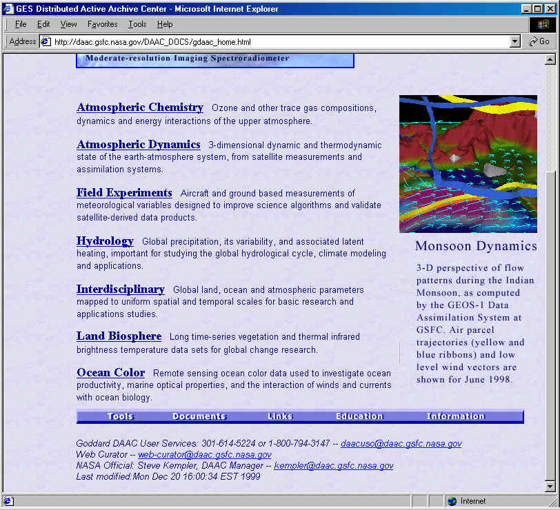
The use of color to produce a cohesive tie which has a
definite semiotic significance is clear in the Monsoon Dynamics image
(associated with the second textlink). Here, apart from the use of blue to
indicate two of the most thematically important elements (the blue ribbons for
airmass drift and the blue arrows for wind movement), there are two yellow
ribbons which are not otherwise visually connected to one another, but which are
meant to represent movements of air masses with some similar (not noted)
property, in contrast to those represented in blue.
The twin organizing principles of both text and visual
images are (1) structural and (2) cohesive. The former is the familiar principle
of wholes and parts (e.g. lists, figure-and-caption); the latter that of
similarities of salient features (e.g. color, or typeface).
The textual unitshere are structurally organized into
headers or titles or link-names and explanatory extended nominal groups. The
structural relation is Halliday’s Expansion: Elaboration, here realized
paratactically (Halliday 1994). The cohesive organization of the list is based
on co-hyponymy (Halliday & Hasan 1976), or more generally co-thematic
collocations, with an intertextual basis (knowing the earth system division into
lithosphere, hydrosphere, and atmosphere, supplemented by the cross-cutting
biosphere).
There are also other very direct ties between principal
elements. For example, the first two textlinks are “Atmospheric Chemistry”
and “Atmospheric Dynamics”, corresponding closely to the thematic
complementarity of chemistry and physics. The former is cohesive with
“ozone” in its image’s title, the latter with “dynamics” repeated in
its image’s title. These lexical semantic ties reinforce and are reinforced by
the visual ties noted above, and by the interactive connection of the dynamic
change of images with movement of the mouse over the vertically stacked
textlinks.
The cohesive linguistic ties, whose function here is
organizational, are of course also functioning presentationally (thematically)
to help construct the semantic relationship between the words of the textlink
and its elaboration on the one hand and the thematic meaning of the image
caption on the other. There is a very high degree of lexical cohesion of the
strongest type (word repetition, identity chaining, reference chaining) between
these, e.g. in the case of the “Monsoon Dynamics”. The overall semantic
relationship is one of re-statement, with some specification or
subcategorization, and particularly the semantic relationship of Exemplification
(dynamics: monsoon: India).
How is the presentational semiotic link built between the
textlink phrases and the visual image itself? First, there is the supporting
organizational connection, implying that there is a presentational or thematic
relationship. Thus the lexical identity from the linktext to the caption title
(“dynamics”) combines with the visual organizational convention of the genre
(structural: caption to figure), to connect to the image as such. When we
interpret the image thematically, we do so in relation (organizational
connection) to the caption text. We identify “flow patterns” “trajectories
… yellow and blue ribbons” and “wind vectors” visually in the image. The
other element in the image, inter-pictorially recognizable as mountains or
topographic relief of some sort, cohesively links back to the elaboration of the
textlink at left: “dynamic … state of the earth-atmosphere system”, in
which the other elements are “atmosphere” and the mountains “earth”.
But what of the orientational meanings here? How do the
verbal and visual signs combine to produce (a) a stance to the viewer/user, and
(b) a stance toward the thematic content presented?
The page as a whole has an explicit orientation: “Your
source for Earth Science data and information” in italics just below the page
title. The second-person address here defines a Source-User relationship and
makes a proposal: offer (Halliday 1994). But the page also makes demands, most
clearly that you use the mouse to reveal the images and captions, and also that
you click on one of the links to proceed to those and only those pages the
designer has provided links to (apart from the default Back operation, or
options afforded by the browser rather the page). The sudden, and unexpected,
appearance of the Monsoon image at right clearly makes a demand on the user’s
attention. These are demands for action, not for information. (We will see an
example of the latter in the Earth Observatory website discussed below.) The
caption text, when it refers to visual elements in the image (“yellow …
ribbons”) also makes an implicit demand that we match these to visual
elements.
Semantically, the textlink and its elaboration and the
caption text present pure offers of information. As such we should consider the
putative source’s stance toward this information: its warrantability (high,
there is no qualification of probability), its desirability (unmarked, except
that monsoons may be considered dangerous, and so information about them useful
and desirable), its normativity (no proposal, so no issue of obligation), its
usuality (monsoons are expectable, the conventions of scientific imaging of the
data presented also as of unmarked usuality), importance (monsoons are important
events, information about them presumably also), comprehensibility (high for the
source, the data and image help us understand monsoons, but maybe confusing or
mysterious for the user, depending on expertise and familiarity with these terms
and conventions), and seriousness (unmarked, high for this genre and register).
Visually, we may ask how the image itself expresses such
stances.
Warrantability: this is not a photorealistic image, it does
not have high visual resolution or realistic detail. It is an abstract
representation, which we infer (from the thematic content of the caption and
intertextual knowledge) is based on sattelite data and faithful to that data,
which would make the warrantability high, even though purely by visual
conventions it might not seem so (Kress & van Leeuwen 1996). We can make
comparisons with the other dynamic images. In the Ozone Depletion image, also
abstract, there is a quantitative coding that adds a high degree of
warrantability, and this coding is presented visually and numerically (for a
similar instance, see the NDVI page analysis below). The image represents point
for point real scientific data. It is not just an imagined scenario. The
“Interdisciplinary” link has an associated image “Global Warming”, which
shows a data graph that again has very high warrantability in the conventions of
its genre. (Lower warrantability is shown by error-bars on data points, or
indications that graphed lines and points correspond to theory or estimates
rather than actual data.) In the Monsoon image we might still have some doubt
about the exact contours of the landscape shown, because conventionally such
images abstract and simplify. The text-warrant in the caption is only for the
accuracy of the ‘flow patterns’, leaving this issue open.
Desirability: nothing in the image itself shows a
“monsoon” as a dangerous storm or flood-causing rain, except for the choice
of a black background for the sky. This choice is presumably purely
conventional, not dictated by the conventions of scientific representation of
data on air flows. I think we can plausibly interpret it as a marker of the
dangerous or serious or undesirable nature of the monsoon, and so indirectly
also as reinforcing the sense of the importance of havingNASA data to understand
it.
Normativity: there does not seem to be an “ought to”
element in this image, though there is a demand of sorts, that the eye follow
the arrows (there are so many of them, almost all aligned in the same
direction). The other orientational stance to the viewer here is signaled by the
overhead view: that we see this as from above (from the sattelite, but much
closer up), with a “God’s eye” view, which is culturally associated both
with warrantability (from on high you see more of what is) and with science (an
objective view from above the fray, of what is true). So the Source:User
relationship is being visually constructed here as one of a giver of information
to one who needs this information, one who is in a position to know, to one who
is not but needs the knowledge. One who can guide understanding to one who needs
to follow that guidance (e.g. the image’s arrows, but also the links
themselves). So there is a kind of normativity here, that the user ought to
trust and use the knowledge the source offers.
Usuality: this is not a very conventional image for most
viewers, though it may be for specialists, and it is not so unusual for anyone
with scientific training. Within the image itself, there are non-naturalistic
features in contrast with the naturalistic ones, mainly the ribbons and arrows,
which are the features explained in the caption. The fact that they need
explanation would seem to indicate that the source regards them as at least to
some degree unusual. In this respect usuality is linked to Comprehensibility:
what is unusual is also often less comprehensible. The explanation makes these
features more comprehensible, but cannot make them more usual. The degree of
comprehensibility also tends to define the implied user: someone for whom the
explanation given is adequate.