| When you visit the 'Storm Surge Flooding in NYC' webpage (which you will be able to access by clicking on the grey button on Printout # D-3), you will find an index map, like the picture on the right. (The picture on the right is not 'active'. It is just to show you what the active map on the 'Storm Surge Flooding in NYC' webpage looks like.) The index map shows Brooklyn, Manhattan, and parts of the Bronx and Queens. Three neighborhoods, Coney Island, Rockaway and Lower Manhattan, are outlined in red. You can click on them to link to storm surge information about each area. | 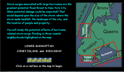 |
| In this exercise, you will need to get information about the neighborhood of Lower Manhattan. When you click on that neighborhood, you will access a webpage that looks like the picture on the right. On that webpage, a contour map of the area is shown at the upper left and a map legend at the lower left. At the upper right is a box in which, once a data point has been selected, a graph with storm surge information will appear. At the lower right is a box in which, once a community site has been selected, a photograph of the site will appear. Data points are selected by clicking on round, numbered circles. Community sites are selected by clicking on circled purple stars. A labeled button links you to a map showing population density. | 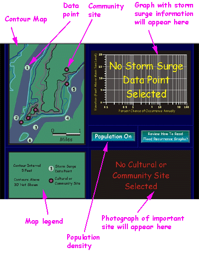 |
| The legend shows the contour interval (C.I.) and the symbols used for data points and for community sites. Remember that on the contour map, the junction between the land (the area shown in green) and the water (the area shown in blue) is equal to the zero foot contour. | 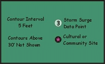 |
| The map of Lower Manhattan is accompanied by a 'population' toggle switch. Click on the switch to find out the population density. Population density will be an important factor in assessing the harm that may be done by a storm surge. Here is a picture of Lower Manhattan with the population density information showing. | 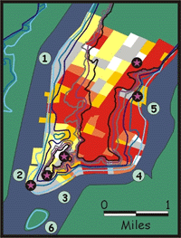 |
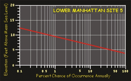
| If you click on Data Point 5 on the Lower Manhattan map, this is the storm surge information graph you will see. (These graphs were modified from graphs provided by the Army Corps of Engineers.) The graph shows you, for the place in the East River indicated by the number 5, the chance in any given year (percent chance of occurrence annually) that a storm surge will raise the water surface to a particular elevation. For example, there is about a 0.7 percent chance in any one year that the water will reach an elevation of 10 feet above current sea level. Putting it another way, that means there is 1 chance in about 143 (100 divided by 0.7) that the water will rise that high in a twelve month period. That is, the recurrence interval is 143 years. For a more complete explanation of how to read the graphs, click on the red button:
|  |
