An Introduction to Data Analysis & Presentation
Prof. Timothy Shortell, Sociology, Brooklyn College
Correlations
The crosstab is a useful way to display the relationship between two ordinal or nominal variables. The measures of association, gamma and the coefficient of contingency, provide an index of the strength of the relationship.
When we have two interval level variables, it is awkward to put them into a crosstab, because there are too many levels of each variable. Still, it would be useful to have a measure of association and a significance test for hypotheses about interval level variables.
The Pearson correlation coefficient is an index of the strength and direction of a linear relationship between two interval level variables.
The Scatterplot
The best way to understand the concept of correlation is to visualize it. We can depict the relationship between two interval level variables in a scatterplot.
Imagine what the scatterplot would look like if there is no relationship between two variables:
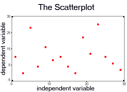
It looks like a random cloud of points. The correlation for this data is 0.000.
Now, imagine what the scatterplot would look like if there is a very strong relationship between two variables:
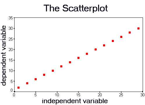
All the points align along a straight line. The correlation for this data is 1.000. This is a perfect positive correlation.
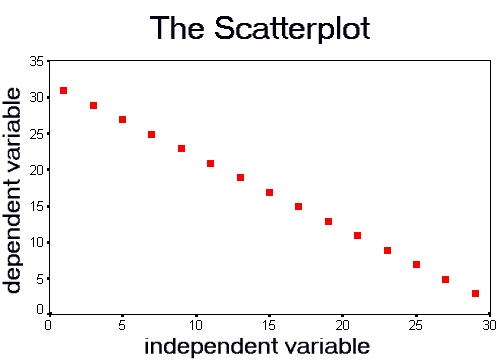
If the data were perfectly related, in the negative direction, the scatterplot would look like:
The Strength of the Relationship
The magnitude of the correlation coefficient tells us how close the relationship is to the ideal cases: no relationship, one the one hand, and the perfect relationship, on the other. If the coefficient is near zero, the relationship is weak. In fact, we would say that there is no relationship between the variables. If the coefficient is near 1.0, then there is a strong linear relationship between the variables.
This scatterplot depicts the relationship between Mean Age and the Suicide Rate for 125 U.S. cities:
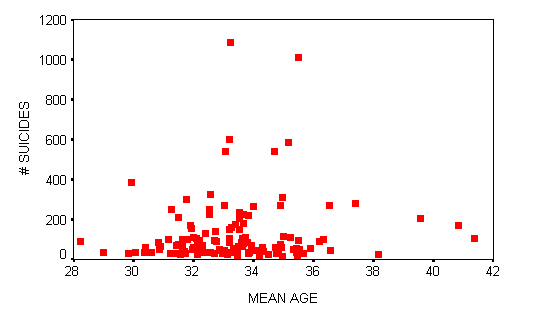
The correlation coefficient is 0.1117. This is a weak positive relationship.
This scatterplot depicts the relationship between the Number of Sports Events and the Number of Museums for the same 125 cities:
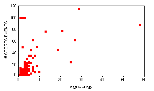
The correlation coefficient is 0.2683. This is a moderate positive relationship.
This scatterplot depicts the relationship between the Number of Authors and the Number of Musicians for these cities:
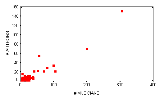
This is a strong positive relationship; the correlation coefficient is 0.9408.
The Direction of the Relationship
The sign of the correlation coefficient indicates the direction of the relationship.
A positive relationship means that larger scores on one variable are associated with larger scores the other variable.
A negative, or inverse, relationship means that larger scores on one variable are associated with smaller scores on the other variable.
Interpreting the Correlation Coefficient
There is no rule for determining what size of correlation is considered strong, moderate or weak. The interpretation of the coefficient depends, in part, on the topic of study. When we are studying things that are difficult to measure, such as the contents of someone's mental life, we should expect the correlation coefficients to be lower.
In these kinds of studies, we rarely see correlations above 0.6. For this kind of data, we generally consider correlations above 0.4 to be relatively strong; correlations between 0.2 and 0.4 are moderate, and those below 0.2 are considered weak.
When we are studying things that are more easily countable, we expect higher correlations. For example, with demographic data, we we generally consider correlations above 0.75 to be relatively strong; correlations between 0.45 and 0.75 are moderate, and those below 0.45 are considered weak.
One useful way to interpret the correlation coefficient is based on explained variation. The square of the correlation coefficient is equal to the proportion of variation in the dependent variable that is accounted for, or explained, by variation in the independent variable.
A correlation of 0.6, for example, indicates that 36% of the variation in the dependent variable is explained by variation in the independent variable.
The Significance Test
If we collect data from a random sample, and calculate the correlation coefficient for two variables, we need to know how reliable the result is. This calls for a statistical test.
Let's say we have collected data on 125 U.S. cities. We have measured the number of persons who listed 'artist' as their profession in census data (in 1000s) and the amount of foundation aid given to arts-related organizations (in $1000s). We want to know if there is a relationship between the number of artists in a community and the amount of arts funding it received.
Start, as always, with the hypotheses. The null hypothesis states that there is no linear relationship between the independent variable and the dependent variable. In our example, the null hypothesis is that there is no relationship between the number of artists in a community and the amount of grant funding it received.
Next, we calculate the correlation coefficient for the sample. The result is:
         ARTISTS

FUNDING  0.7153

         p<0.05

         ( 125)
We consult the significance test (a special form of the t-test) to determine if the result is reliable. As always, if the significance, p, is less than or equal to 0.05, the result is statistically significant.
We can reject the null hypothesis and interpret the correlation coefficient. The number of artists in a community is positively related to the amount of grant funding it received. Communities with more artists tended to receive more grant funding. About 51% of the variation in amount of grant funding is accounted for by variation in the number of artists in the community.
Partial Correlations
Based on the data from our sample, we concluded that there is a positive relationship between number of artists and amount of grant funding. We assumed that the number of artists in a community is the causal factor, or, in other words, that the presence of more artists in the community leads to more grant funding.
This makes logical sense: communities with more artists are more likely to apply for grants -- indeed, it is the artists themselves who tend to apply for grants.
We must be careful in our interpretation, however. Correlation does not imply causation. We cannot be certain that the number of artists is causally related to the amount of grant funding. It may be that both variables are caused by a third, unspecified variable.
What other factors might influence both the number of artists in a community and the amount of grant funding it received? The most likely factor is simply community size.
We want to know if there is a relationship between number of artists and amount of grant funding when we control for community size. Community size is a control variable in this example. We will use a partial correlation to determine the effect of number of artists on amount of grant funding, independent of community size.
We will let SPSS calculate the partial correlation. Remember, the original correlation was:
         ARTISTS

FUNDING  0.7153

         ( 125)
The partial correlation, which is on the same scale (-1 to 1) as the original, is:
         ARTISTS

FUNDING  -0.0405

         p>0.05

         (  125)
The partial correlation is near zero. This tells us that there is no independent effect of number of artists on amount of arts funding. Community size, not number of artists, appears to be the true causal factor.
To know for certain that community size is the causal factor we would need to control for other potential causal factors.
All materials on this site are copyright © 2001, by Professor Timothy Shortell, except those retained by their original owner. No infringement is intended or implied. All rights reserved. Please let me know if you link to this site or use these materials.