The Earth Observatory Site
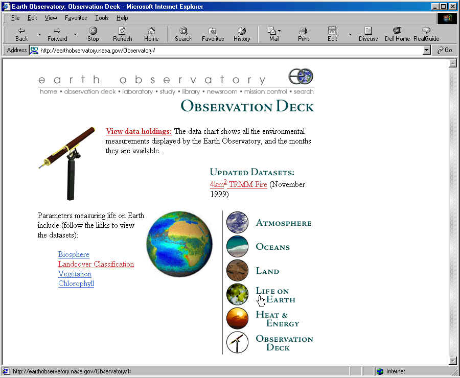
The level of multimedia literacy demands at the Earth Observatory (EO) site is hardly minimal. Users of these webpages confront the complexities of not just simplified scientific text, but an interactive glossary function, links to background information in documents accessed from a Library page, links to closely related websites documenting research projects on related scientific topics (the Study), and most notably the option of linking to an interactive system for scientific visualization of relevant satellite data (the Observation Deck, Figure 1a).
Figure 1a. NASA Earth Observatory Observation DeckWebpage (January 2000, http://earthobservatory.nasa.gov/Observatory/ )
It is this main Observation Deck page which is organized along strikingly parallel lines with the Goddard GES DAAC main page. By selecting a ‘parameter’ (i.e. type of data derived from satellite sensors, e.g. Vegetation) and a time range (see Figure 1b), users can display, in the form of color-coded maps (Figure 1c), an animated display that shows changes in the values of this parameter worldwide over the chosen time range, and even display side by side for comparison maps coded for two different parameters. Users have the choice of three display modes: mercator-like projection maps in an animated strip (Figure 1c, rather like cartoon frames that can be flashed by quickly to show a single dynamically changing image), a grid or matrix table of maps each for a different fixed time within the range, and a globe which shows only a single time frame, but can be rotated to show the color-coded values of the parameter(s) at all points on the earth, or as seen from any direction in space above the earth.
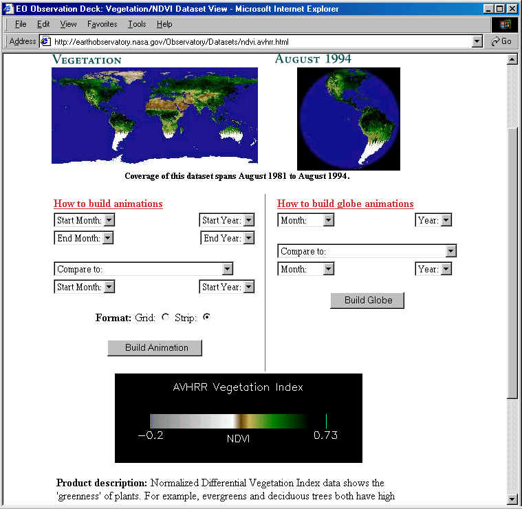
Figure 1b. NASA Earth Observatory: Life on Earth, Vegetation Dataset Webpage
(January 2000, http://earthobservatory.nasa.gov/Observatory/Datasets/ndvi.avhrr.html )
Moreover, the color-coding is quantitatively based, and a key is provided that shows a continuously variable color-spectrum and the corresponding numerical values (Figures 1b, 1c). Along with this is an explanatory paragraph discussing what the color-coded image maps show that is of scientific importance, and in some cases what the technical nature of the parameter is and from what satellite instrument it is derived (e.g. Figure 1b, truncated at bottom). These latter facts are not usually fully explained, even if they are mentioned.

Figure 1c. Display of Vegetation NDVI
Data in Animated World Map with Key
(January 2000, http://earthobservatory.nasa.gov/Observatory/showqt.php3
)
The Earth Observatory site in fact also includes a ‘Style
Sheet’ for potential contributors, and this makes it clear that its genre
conventions, at least verbally, are journalistic. It aspires to something like
the level of sophistication and public accessibility of a print publication such
as Scientific American. There is almost no mathematics in the EO site,
but regular use of both numerical values and visual representation of
quantitative information and relationships. In making use of the Observation
Deck’s scientific visualization facility, visitors must integrate scientific
language, specialized visual display genres, quantitative values, and
time-dependent animation. The latter is also interactive; the user employs a
motor routine to control the animations by dragging the mouse over the images
while a counter changes to show the month and year of each frame.
The demands of the EO site represent the minimal goals of scientific multimedia literacy in the current school curriculum, according to generally agreed on national standards (AAAS 1996, NRC 1996). They would not be sufficient for tertiary study of a scientific or technical field, or even for the work that John was doing in his advanced science classroom in a secondary school. They do show us, however, how print genres of sophisticated popularized science are evolving to take advantage of the new computational possibilities of internet-based multimedia.